Architectural Precast 101: Design Ideas for Driveways, Walkways, and Patios
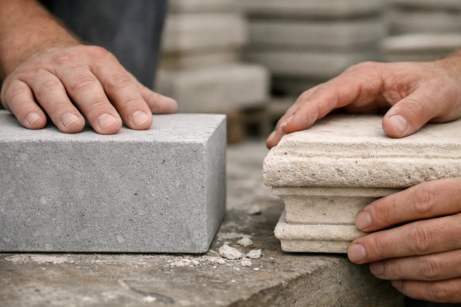
A contractor snaps chalk lines across a front driveway. On the tailgate, the homeowner has four sample pieces spread out in the sun, turning each one a few degrees to compare the color against the porch steps, the front walk, and the backyard door. One glance tells the truth: this choice has to work from the curb all the way to the patio.
That is where architectural precast products earn their keep. They show up in entryways, walkways, patios, and pool areas because they can handle real use while still giving you plenty of design range. They are also popular for a simple reason: done well, they look good without asking for constant upkeep.
But the best result rarely starts with color alone. You get a better surface when you match the product to the job first, then shape, then finish, then pattern. That order saves a lot of regret.
#1 Start with the traffic load
What it is
Before you compare shapes or colors, look at how the space actually works. A front walkway sees foot traffic. A patio carries chairs, grills, and planters. A driveway takes the full weight of cars, braking, and turning tires. Pool areas bring water into the mix. Architectural precast products are used in all of those places, but that does not mean one style fits every one of them.
On site, we usually map the heaviest use first. That sounds basic, yet it changes the whole design conversation. A two-car driveway in Westchester and a side garden path in a Brooklyn townhouse may both use precast elements, but they demand different priorities.
Why it matters
If you design from appearance alone, you can back yourself into a weak choice. Narrow units that look elegant on a mood board may not be the smartest call for a daily driveway. A surface that feels pleasant under bare feet may need a different finish when it sits under outdoor dining furniture.
Design for the heaviest use first; style choices should support the load, not fight it.
This is also why precast pieces stay so popular. They can be low maintenance and adaptable, but only when the design respects the use. Think of traffic load as the frame underneath the style.
Quick example
Say you are reworking a suburban front yard with a driveway, an entry walk, and a small sitting patio off the side door. Start with the driveway. Choose a pattern and unit size that can handle vehicles comfortably. Then let the walkway and patio borrow the same color family or border detail so the whole property reads as one composition, not three unrelated decisions.
#2 Choose a shape that matches the architecture
What it is
Shape is the fastest visual signal in a layout. Architectural precast products come in a wide variety of forms for architectural and beautification needs, including irregular pieces, planks, rectangular units, square units, and softer round-edged profiles. Even before someone notices color, they read the geometry.
That is why two patios in the same gray tone can feel completely different. One may read crisp and modern with long plank units. Another may feel older and softer with an irregular or mixed-size layout.
Why it matters
Shape should echo the language of the house. If your home has clean rooflines, large windows, and minimal trim, straight rectangular or square pieces usually make sense. If you are working with a Colonial, Tudor, or cottage-style setting, irregular modules or softened edges can feel more natural.
Use shape to echo the home’s lines: straight, squared-off forms for modern architecture; softer or irregular forms for older or more casual settings.
This decision affects more than style. Shape influences joint rhythm, border options, and how formal the finished surface feels. A symmetrical front facade often benefits from a clear, ordered module. A winding garden walk usually does not.
Quick example
Picture a mid-century ranch with a low roof and horizontal siding. Long rectangular planks on the front walk can reinforce those horizontal lines beautifully. Now switch to a shingled Cape Cod with a curved path to the porch. A square-and-rectangle mix, or even a more casual irregular format, may feel far more at home there.
#3 Use finish to set the mood and the underfoot feel
What it is
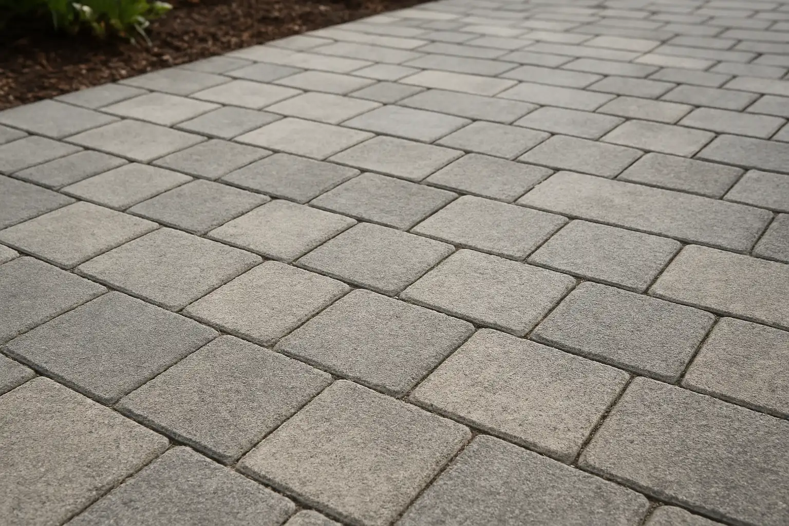
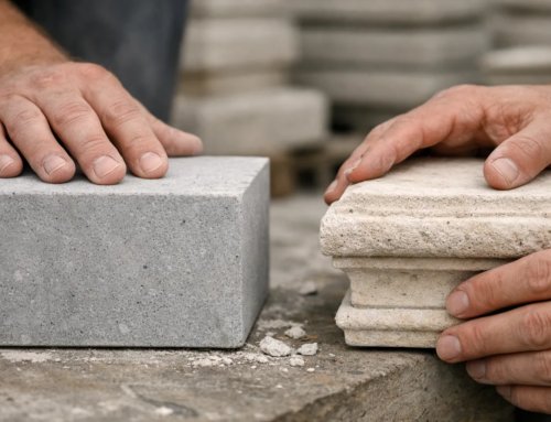
Finish is the surface personality of the product. Available profiles often include flat top, pillow top, smooth, textured, tumbled or antique, worn, beveled or chamfered, and rounded edges. The source material also points out something many buyers miss: quality is not just color choice, but how vivid the color looks and how quickly it may fade over time.
That means two products in a similar shade can age very differently. One may keep a rich, even face. Another may wash out faster or lose the contrast that made the sample attractive in the first place.
Why it matters
Finish affects both appearance and feel. Smooth units can read sleek and contemporary. Textured faces often feel more grounded and forgiving outdoors. Tumbled edges suggest age and softness. Beveled units create a more defined grid. Underfoot, those differences are easy to notice—especially around a pool, a dining patio, or a front walk used in wet weather.
Don’t pick color alone; finish controls whether the design reads crisp, rustic, formal, or relaxed.
| Finish Type | Visual Read | Best Use Direction |
|---|---|---|
| Smooth or Flat Top | Clean, sharp, contemporary | Modern patios, formal walks, restrained entries |
| Textured | Natural, grounded, practical | Walkways, pool surrounds, busy family patios |
| Tumbled or Antique | Weathered, relaxed, traditional | Cottage gardens, older homes, rustic courtyards |
| Beveled or Chamfered | Defined joints, structured pattern | Driveways and layouts where the grid is part of the look |
Quick example
Take one charcoal color and compare it in two finishes. In a smooth finish, it can look almost architectural—something you might expect at a modern home in Fairfield County. In a tumbled finish, the same color can feel softer and more established, closer to an old brick court. Always look at samples in daylight, and if possible, look at them wet and dry.
#4 Build driveways around strength and pattern
What it is
A driveway is not just a large paved rectangle. It is a working surface that takes repeated stress in the same spots: where the tires enter from the street, where a driver turns into the garage, and where vehicles stop or back out. That is why pattern matters so much here.
Common layouts such as herringbone and running bond are widely used on driveways for a reason. They are familiar, but not arbitrary. They help distribute movement and create a surface that looks organized from the street.
Why it matters
If you want a driveway to look sharp for years, function has to lead. Compare products carefully. The source material emphasizes differences in manufacturers, shapes, colors, and quality, including how well colors hold saturation over time. That matters more on a driveway than people expect, because this is usually the largest hardscape plane at the front of the property.
For driveways, function should lead the pattern choice; the cleanest look is the one that also works hardest.
A weak pattern choice can make a strong product feel busy or flimsy. A good pattern can make even a simple color field look deliberate. On a property with a steep apron or frequent turning, I almost always look at interlocking layouts first.
Quick example
Imagine a front driveway with a straight shot to a two-car garage. A 45-degree herringbone field with a contrasting soldier-course border gives you both order and durability. If the house has formal symmetry, keep the border clean and narrow. If the driveway flares near the street, let the border trace that geometry so the layout feels intentional from curb to garage.
#5 Design walkways to guide movement and curb appeal
What it is
A walkway does two jobs at once. It moves people from one point to another, and it tells them where to look. That is why walkways deserve more thought than a simple strip of paving from sidewalk to stoop.
Architectural precast products work especially well here because you can shape the route, control the rhythm, and tune the color to the house and landscape. A narrow urban front path, a suburban entry walk, and a side-yard connector can all use the same material family in different ways.
Why it matters
Good walkways feel obvious without feeling boring. The pattern can point toward the front door, pull the eye through a gate, or slow the pace near a garden bed. Color also matters. Since these products come in many shapes and colors for beautification needs, you can make a path feel quiet and formal or lively and welcoming.
A walkway is a visual guide as much as a path; use a pattern that points people where to go.
You do not need drama to get this right. Often, a subtle border, a slightly warmer tone, or a directional running bond does the job. The goal is clarity. If visitors hesitate at the curb, the design has not finished its sentence.
Quick example
Think about a front walk lined with boxwoods and low lighting. A rectangular product laid in a running bond can draw the eye straight to the porch. If the house has a side entry used every day, you might widen the path slightly near the steps and shift to a small border detail there, signaling arrival without adding another material.
#6 Turn patios into outdoor rooms
What it is
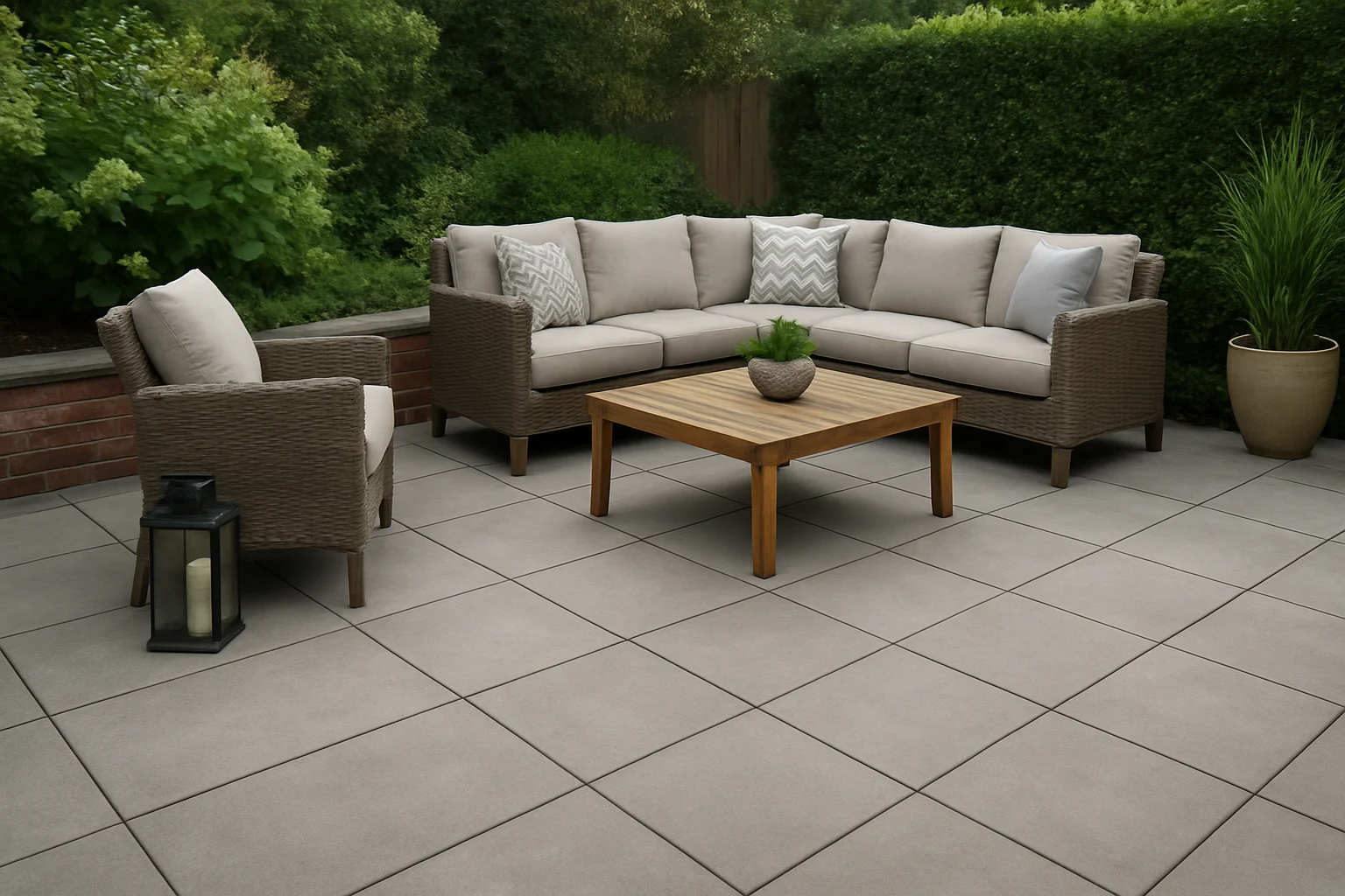
A good patio is not just open space. It works like an outdoor room, with zones for dining, lounging, cooking, and circulation. Architectural precast products are well suited to that job because they come in many colors and shapes, and multi-piece formats such as two-piece and three-piece sets can create a more layered, relaxed field.
This is where design can become more generous. Unlike a driveway, a patio often invites variation—larger modules, mixed sizes, borders, and even a soft shift in tone to separate one area from another.
Why it matters
Without structure, large patios can feel flat. Furniture floats. People cut across awkward corners. The grill crowds the dining set. When the pattern helps organize the space, the patio instantly reads better. Borders can outline a dining zone. A change in laying direction can mark a lounge area. A darker band can handle circulation near the back door.
Think of the patio as an outdoor room: borders, modules, and color shifts can define spaces without adding walls.
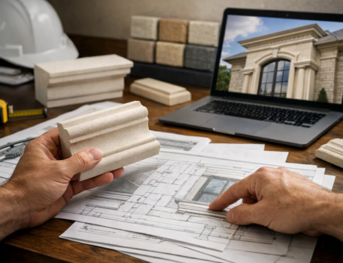
On larger residential and commercial projects, the patio may also need to coordinate with nearby elements such as coping, wall caps, thin veneer, columns, or pier caps. When you plan those relationships early, the whole site feels composed instead of pieced together over time.
Quick example
Say you have a 16-by-24-foot backyard patio behind a kitchen. Put the dining table closest to the door for easy service. Set a lounge grouping farther out. Keep a clear path to the grill. A three-piece pattern in the main field can soften the scale, while a darker border around the dining area helps it feel anchored—almost like an outdoor rug.
#7 Match pool-area surfaces to comfort and safety
What it is
Pool decks have their own demands. The surface has to look calm, feel good under bare feet, and handle water constantly. Architectural precast products are often used in pool areas, and the available finishes—textured, rounded, beveled or chamfered, and pillow-top among them—give you a lot of range.
Because people experience this space directly with their feet, poolside choices tend to feel more immediate than driveway or front-walk choices. You notice glare. You notice texture. You notice edges.
Why it matters
Near water, trend should never outrank comfort. Texture helps with footing. Softer edge profiles can feel friendlier in barefoot zones. Lighter colors often read cooler and calmer in full sun, while very dark surfaces can absorb more heat. The visual quiet of the surface matters too. Pool water already brings movement; the paving does not need to compete with it.
Texture matters more than trend near water; the surface has to look calm and feel dependable.
This is one place where I urge people to slow down and handle samples in person. If the product looks refined but feels slick or harsh, keep looking. A pool deck is a use-driven surface every single day of summer.
Quick example
Picture a rectangular pool with light lounge chairs and clipped shrubs along the fence. A light sand or soft gray textured product with a gentle edge profile can create a clean frame around the water without glare or fuss. Wet footprints fade into the scene instead of shouting across a dark surface.
How to choose the right option
Start with the site function
If you feel overwhelmed by samples, reduce the decision. Start with the job of the space. Ask three blunt questions:
- Will this area carry cars, foot traffic, furniture, or bare feet?
- Does it sit in full sun, near water, or in a freeze-thaw climate?
- Does it need to connect visually to other surfaces on the property?
That filter usually eliminates half the options fast. Architectural precast products are often chosen because they are attractive, relatively low cost, and low maintenance, but that does not remove the need to match the product to the use.
Narrow by style and shape
Once function narrows the field, turn to the house. Is the architecture modern, formal, rustic, or transitional? Then choose shape and pattern to reinforce that answer. Long rectangles, squares, irregular modules, and mixed-size sets all send different signals.
| Project Area | First Priority | Safe Starting Direction |
|---|---|---|
| Driveway | Load and turning stress | Interlocking pattern, durable finish, restrained color |
| Walkway | Movement and visibility | Directional layout, clear border, house-matched shape |
| Patio | Zone definition and comfort | Mixed sizes, border accents, furniture-friendly surface |
| Pool Area | Comfort and wet traction | Textured face, soft edges, calm light color |
If you are working on a broader exterior package, this is also the point to think beyond the paving alone. Coordinating precast pieces with coping, wall caps, balustrade, thin veneer, or columns can tighten the design. For projects that need that level of coordination, Coral Cast can help homeowners, builders, architects, and contractors compare related architectural precast options instead of selecting every element in isolation.
Compare maintenance and long-term appearance
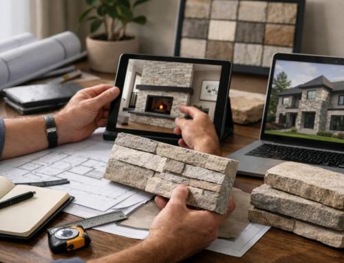
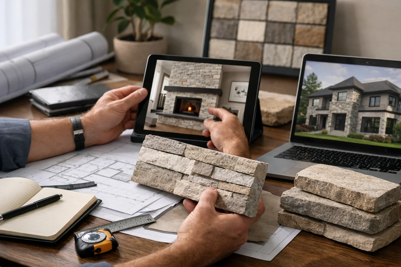
Now look at the long view. Compare manufacturers, color saturation, finish quality, and how the product is likely to age. Ask to see installed examples if you can. Look at samples in sun and shade. Put them next to the siding, the stone veneer, the front door color, and any nearby coping or wall caps.
Best choice rule: if two options look good, pick the one that suits the traffic and the climate first.
This last step saves you from buying with only the sample board in mind. The right choice is the one that still makes sense after rain, after summer heat, after a few winters, and after years of ordinary use.
Good architectural precast products do more than decorate—they carry weight, guide movement, and give outdoor space a finished shape.
When you match layout, finish, and shape to the actual job of the space, the decision gets simpler and the result gets stronger. When you look at your own property from curb to backyard, which surface needs a smarter fit between appearance and everyday use?
Plan Better Surfaces With Coral Cast
Coral Cast’s New York architectural precast concrete manufacturing gives homeowners, builders, architects, contractors, and owners custom-designed, properly cured architectural stone products with showroom help, free estimates, and secure U.S. shipping.