
Using Precast Together: A Designer’s Guide to Contrast and Detail
Intro: Define the Problem and the Design Payoff
The core tension: traditional expression versus modern construction speed
A designer spreads material samples, a precast corner mockup, and three marked-up elevations across the conference table. One red circle lands at the sill return. Another lands at the parapet. That is where precast elements either become a crisp composition or a visible argument.
You usually combine these materials for a simple reason: you want architectural character without accepting every limitation of fully hand-laid work. Precast concrete can bring strength, flexibility, and a wide range of finishes together in one system. That approach can cut much of the labor and time tied to traditional site-built work.
That tension shows up on every project type. On a Brooklyn townhouse renovation, it may mean strong expression at the street face with precast coping and sills doing the hard edge work. On a mid-rise school or apartment block, it may mean large wall panels arrive ready for installation, so the facade closes faster and more predictably.
What a successful hybrid facade should deliver visually and practically
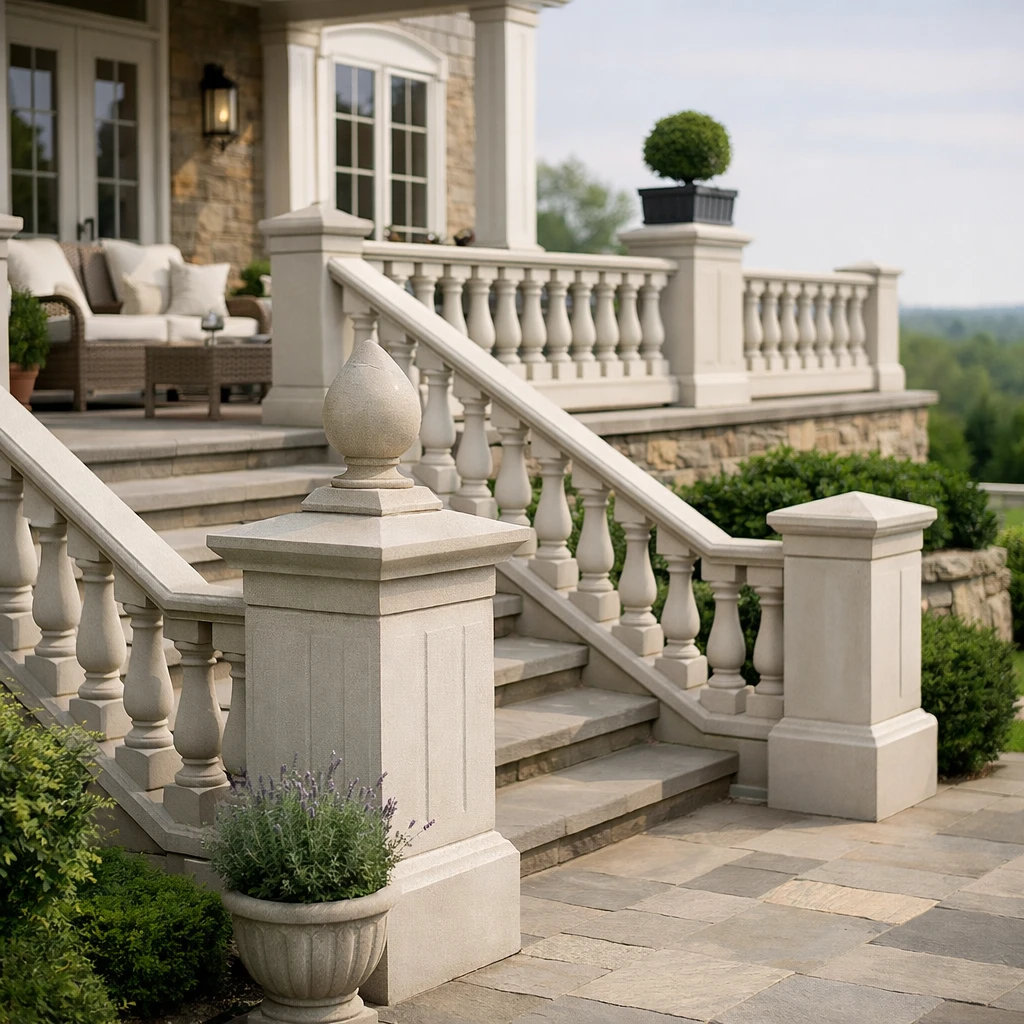
A good hybrid facade does two jobs at once. Visually, it establishes hierarchy. One material can carry the tactile field, the human scale, the “this belongs here” feeling. Precast can frame openings, sharpen corners, form water tables, finish parapets, and handle pieces that want precision — balustrades, coping, thin veneer accents, stone moldings, columns, pier caps, wall caps, even decorative trim transitions.
Practically, the wall needs to be buildable. Panelized systems can reduce the number of trades needed on-site while improving uniformity and quality compared with more fragmented field assembly. That matters. I’ve seen handsome elevations fall apart in the field because the drawings loved contrast but ignored panel joints, tolerance, and lift points.
The best precast projects do not hide the difference between materials; they use that difference to create hierarchy.
Prerequisites and Tools: Gather the Design Inputs Before You Draw Details
Project information to collect before detailing
Do not start with the prettiest elevation. Start with the hard limits. Good design coordination covers economy, fabrication requirements, panel thickness, attachment details, transport considerations, and plant capability. That list is your warning: if you have not gathered those inputs, your detail is still a sketch.
| Input | Why You Need It Early | Where It Usually Comes From |
|---|---|---|
| Structural grid and opening schedule | Sets repeatable panel widths, return conditions, and joint alignment | Architectural and structural drawings |
| Panel size target | Drives layout, shipping logic, and crane planning | Precaster input and schematic facade studies |
| Wall thickness and performance target | Changes reveals, attachment depth, and window relation | Envelope consultant, code review, energy goals |
| Movement and joint strategy | Prevents cracking, misalignment, and sealant chaos | Facade details and structural coordination |
| Erection and transport limits | Keeps the design inside real lifting and route constraints | Precaster, erector, logistics team |
| Exposure conditions | Affects finish choice at parapets, bases, and horizontal surfaces | Site analysis and durability review |
Reference tools and technical resources to keep open
You want three stacks of information open while you work: education, tested product data, and dimensioned resources. Technical guidance, specifications, test reports, and product profiles are all useful when you are making coordination decisions. Those are not background reading. They are working tools.
- Keep manufacturer size charts open while setting coursing and return depths.
- Check product and technical profiles before you commit to a shape or finish.
- Use calculators and dimension data when a window rhythm must align with module spacing.
- Review test reports and standards before a mockup review, not after a field issue.
- Pull certification and specification requirements into your coordination set.
Physical samples and review tools that make decisions faster
Real pieces beat renderings. Put a finish board, a precast return sample, a sill profile, and a joint sketch on the same table. Then walk them into daylight. A warm red unit that looked balanced on screen can turn loud next to a cool gray precast band at 9 a.m. sun. The same goes for texture. A deep drag-face finish beside a smooth cast surround can be excellent — or too busy — depending on the reveal depth.
Bring a scale rule, elevation printouts, and a camera. If you are comparing coping, pier caps, wall caps, or thin veneer trims, mock up the actual meeting line at a corner. That one move can save a week of circular review.
If you do not know the panel size, performance target, and erection limits early, the detail is already too late.
Step 1: Decide Where Precast Should Lead or Stay Quiet
Choose the primary public-facing elevations
Every facade does not deserve equal emphasis. Pick the elevations that carry identity — the street corner, the front entry, the courtyard face people actually occupy. Let stronger finishes lead there. On secondary elevations, you can let precast do more of the organizing work, especially when budget, schedule, or access pushes you toward simpler repetition.
We usually mark this in plan and elevation before color discussions begin. A school entry may get the deepest expression at the ground and around the doors, while the long side walls rely on cleaner precast fields with restrained accent zones. You are not reducing design. You are assigning visual rank.
Reserve the most visible areas for the strongest texture or color contrast
Broad aesthetic freedom is useful only when you edit. Strong contrast belongs where people read the building up close: entry portals, corner turns, parapet breaks, framed windows, terrace edges. If every face gets the same color jump and texture competition, the eye gives up.
Uniformity and finish quality matter most where details are most visible. A disciplined field with sharply cast lintel bands, sill lines, or column wraps often looks richer than a facade trying to prove every possible idea at once.
| Facade Zone | Let the Main Material Lead | Let Precast Stay Quiet |
|---|---|---|
| Main entry | Yes — texture and human scale matter most here | Use as framing, trim, or base logic |
| Long secondary wall | Only in controlled bands or panels | Yes — calm repetition helps the whole elevation |
| Parapet and coping line | Usually secondary | Yes — precision and weathering control matter |
Do not give every facade the same visual priority; contrast works best when one element clearly leads.
Step 2: Select Color, Size, and Texture to Build the Contrast
Use color to either blend with or sharpen the precast field
Treat finish selection like composition, not shopping. You are deciding how the eye will move. If you want the wall to feel carved and orderly, bring the materials into the same tonal family and let joints, reveals, and shadow carry the contrast. If you want the facade to read as layered and graphic, widen the tonal gap.
Here is a familiar pairing: a red or burgundy accent with limestone-toned precast gives you a civic, grounded look that suits schools, churches, and traditional multifamily work. A cream finish next to nearly matching off-white precast softens the boundary and makes the geometry feel quieter. Product organization by color, size, shape, and system is a reminder that the visual outcome does not come from color alone.
Use size, shape, and texture to control scale and shadow
Technical guidance on achieving color, form, and texture teaches the right lens. Size changes scale. Shape changes rhythm. Texture changes light. A long-format unit can stretch a facade horizontally. A more traditional modular size tends to reinforce a familiar civic cadence. A rough face increases shadow and presence. Smooth precast next to that roughness can make openings feel sharper than their actual dimensions.
| Material Variable | What It Changes | Good Use Case |
|---|---|---|
| Lighter color | Reduces visual weight | When you want the panel joints and reveals to carry the design |
| Darker color | Adds depth and contrast | At entries, base zones, or framed volumes |
| Longer unit | Stretches perceived width | Contemporary elevations with strong horizontal lines |
| Heavier texture | Increases shadow and tactile reading | Areas seen up close, such as stoops or courtyard walls |
| Smoother face | Tightens the overall composition | When precast profiles already provide enough relief |
Think about scale the way you think about type on a page. A thick serif on every line gets tiring. So does maximum texture across an entire facade. Let one move speak clearly.
Choose finishes the way you choose a typeface: contrast, spacing, and scale matter as much as the base color.
Step 3: Lay Out the Panel Geometry for Clean Joints and Efficient Fabrication
Optimize panel layouts to reduce awkward cuts and one-off pieces
This is where good-looking elevations become buildable facades. Design economy matters more than it sounds. Repetition is not the enemy. Repetition is what lets the facade feel calm, intentional, and affordable to fabricate.
Start with the structural and opening rhythm. If your windows stack on a regular bay, let panel breaks reinforce that bay. If the corner condition wants a consistent return, do not wreck it with a last-minute offset just to preserve a decorative band. One-off pieces, odd slivers, and misaligned returns almost always show up later as cost, delay, or visible compromise.
Plan joints, reveals, and corners before finalizing elevations
Draw the joint lines early. Then draw the reveals that make them look intentional. Then solve the corners. In that order. When the joint lands at the edge of a window jamb, across a projecting sill, or near a parapet step, you need to know exactly which material owns the edge and how the thickness changes will be resolved.
Panelized systems can streamline construction and reduce the number of trades on-site. You only get that benefit if the geometry is disciplined. A facade with six clean panel types usually beats a facade with fourteen special conditions, even when the rendering likes the second one better.
| Geometry Check | Ask Yourself | What It Prevents |
|---|---|---|
| Panel width | Does it repeat at major openings? | Random vertical joints |
| Corner return | Is the wrap consistent and dimensioned? | Visual breaks at building edges |
| Reveal depth | Does it clarify the material change? | Flat, muddy transitions |
| Module spacing | Does it die cleanly into trim and openings? | Thin cuts and forced adjustments |
The best-looking facade is usually the one with the fewest awkward cuts.
Step 4: Build in Performance and Envelope Logic from the Start
Choose the wall build-up that fits the assembly thickness and performance goal

A beautiful exterior can still fail as a wall. Performance and fabrication techniques are not a separate conversation. They change thickness, edge conditions, attachment zones, and the apparent depth of the facade. If you want deep window reveals, strong shadow lines, and a tight panelized system, you need the enclosure logic on the table while you are still studying the elevation.
Start with the performance target, then compare it against allowable wall depth, opening conditions, and structural support. A residential project with tight floor-area pressure may not tolerate the same build-up as an institutional facade. A coastal exposure may change how you prioritize durability at horizontal profiles such as coping and sill pieces.
Check how the precast assembly affects the building envelope
Guidance on wall performance and assembly thickness helps designers keep the envelope conversation grounded. That is the practical side of design discipline. The face, the body, the insulation layer, and the water-management strategy must read as one assembly, not four separate notes in a spec section.
Precast can provide aesthetic and practical benefits including durability, resiliency, and cost-efficiency. You protect those benefits by reviewing the full chain of enclosure conditions:
- Window perimeter transitions
- Parapet and coping interfaces
- Base-of-wall splash zones
- Shelf angles, slab edges, and floor transitions
- Corners where continuity often gets messy
If the thickness line jogs wildly to preserve a surface pattern, the pattern is winning the wrong argument.
A beautiful facade still fails if the performance layer is treated as an afterthought.
Step 5: Coordinate Fabrication, Transport, and Delivery Before Issuing the Final Detail
Confirm plant capabilities and custom fabrication expectations
A detail is not finished when it looks resolved on your screen. It is finished when a plant can produce it consistently. Manufacturing quality depends on process as much as intent. Ask early which elements are standard, which require custom molds, and which surface treatments change production sequence.
If your project mixes flat panels with shaped work — say coping, columns, pier caps, wall caps, or balustrade pieces — talk to the manufacturer before the detail set hardens. A manufacturer such as Coral Cast can tell you quickly whether a profile is stock, a modified stock mold, or a fully custom run. That answer changes schedule and cost far more than most teams expect.
Review shipping, lifting, and transport constraints
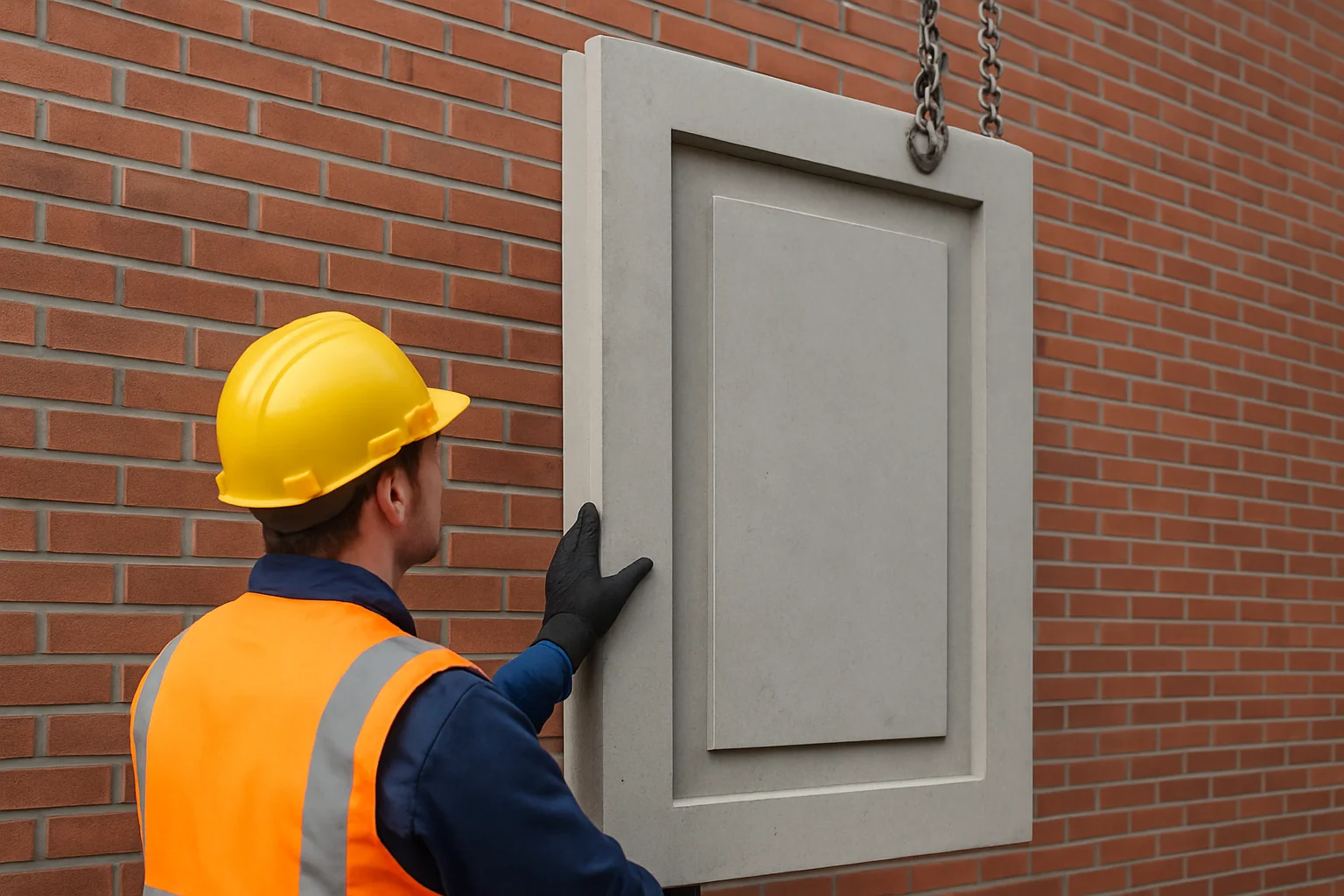
Delivery and transportation considerations are where many elegant details get humbled. Can the unit ship safely? Can it turn into the site? Can the crane pick it without fighting nearby power lines, sidewalks, or adjacent structures? Does the connection layout allow the installer to set the panel without field improvisation?
Similar visual outcomes can have very different field requirements. Review the method, then review the means of getting it into the air and onto the jobsite.
| Final Coordination Topic | Question to Answer |
|---|---|
| Plant capability | Can the panel finish, pattern, and profile depth be produced repeatedly? |
| Specifications | Does the project require specific documentation or product requirements? |
| Shipping | Do the panel dimensions and fragility fit route and packaging limits? |
| Lifting | Are pick points and panel balance compatible with the site crane plan? |
| Delivery access | Can the installer actually reach the set location without redesign? |
If a detail cannot be fabricated, shipped, and delivered safely, it is not a finished detail.
Common Mistakes: Avoid the Failures That Break the Contrast
Using contrast without a clear hierarchy
The first mistake is simple: too many ideas with equal volume. One surface is dark here, light there, rough on one bay, smooth on the next. Precast frames every opening, every corner, every parapet, every band. Nothing leads. Everything competes.
Panelized systems can produce strong uniformity and finish quality. But uniform production cannot rescue confused composition. Decide what should read first from 100 feet, then what should reward the closer view from 10 feet.
Ignoring movement, tolerances, and joints
The second mistake is treating the material line like a graphic stripe. It is not. It is a construction event. Movement, sealant space, tolerances, and edge conditions all live there. If you ignore that, the joint will announce itself later with a crack, a crooked return, or a band that misses alignment just enough to bother everyone forever.
I tell teams to draw the joint full-size before polishing the pattern. That sounds backward until you have stood below a misaligned sill band on a finished building. Then it sounds obvious.
Skipping mockups and test-based review
The third mistake is believing product photos and renderings are enough. They are not. Verified performance information belongs next to the mockup review, not buried in procurement. If you are counting on a tight color match, a flush corner, or a crisp return, build and inspect it.
Mockups do more than check appearance. They expose sequencing problems, reveal where reveals are too shallow, and show whether the intended contrast reads in actual light. They also protect you from the false confidence of screen color.
- Review the corner first.
- Review the sill and parapet conditions second.
- Check shadow, alignment, and sealant spacing in daylight.
- Compare the mockup against technical data and approved samples.
Design the joint first, the pattern second.
Precast work best when the visual idea and the construction logic arrive at the table together.
Set the hierarchy, choose the surface expression, lock the panel geometry, and solve the envelope and delivery path before you romanticize the rendering. When you review your next elevation, where should precast elements meet so the joint reads like design intent instead of damage control?
Refine Precast Choices With Coral Cast
Coral Cast’s architectural precast concrete manufacturing supplies a wide selection of stone and precast products with showroom guidance, free estimates, secure packaging, and delivery across the tri-state area and nationwide.